SignalZZ is a product that gives traders access to continuous trade opportunities throughout the day, via SMS, email, or a dashboard. A team of statisticians and market analysts have built algorithms that analyze the historical movements of the market and based on them generate strong ideas for entry and exit strategies.
Some people want to invest money, but they need outside guidance and help because they do not understand how trading works and may lose money or give up the investment in advance.
This website was created to help traders understand better the trading world and make money.
Competitive Research
Many websites sell signals, but most of them offer only Forex signals and focus on a particular time zone.
The existing signal websites look outdated, they have a lot of information that is cluttered and inconvenient for the user.
Insights
There are tree main and essential behavioral patterns that I’ve learned from the research and I would like to use the Signalzz web-site
Signals Dashboard
Some websites have a complete system, some have tables and some even combine tables with more data.
I have chosen to do it in the simplest and clearest way so that the dashboard will be comfortable even for people without a background in trading.
Call to Action and Registration
I chose to design the site in a marketing way, Initial registration is already in the header of the main page and a lot of buttons throughout the site.
Plan Selection
Most sites I have seen have a selection of different plans at different prices, so I also chose three program options.
Goals and Motivation
Make users recognize the website as a trustworthy source of information.
Provide comprehensive information in an orderly way.
User Persona
Ron is a programmer at a high-tech company, earning pretty well. Ron has savings in the bank, the money does not earn large profit rates. He wants to invest the money to earn more than that, but he is afraid of losing instead of winning because he does not understand much about trading.
Goals
Get trustworthy information.
Understand the sources of information.
Learn how trading works, so that in the future it will be possible to trade alone without help.
Earn money.
Pain Points
Waste of time and money.
A complicated and incomprehensible system.
Data is confusing and it is not clear how to use it.
Ron Adams
Programmer
28 years old
User Flow
Output
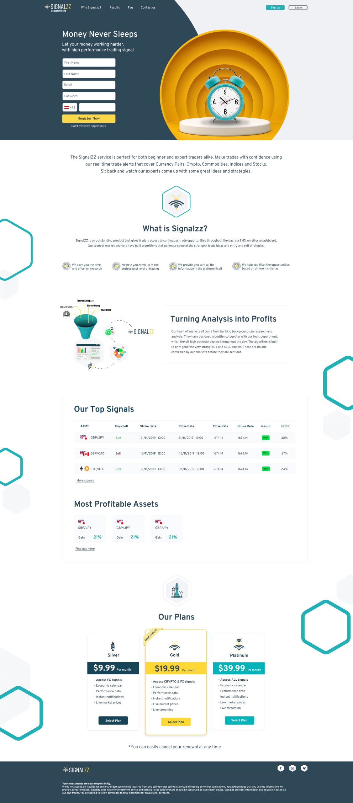
The design concept is based on the bee, who "buzzes" and says when it is worth investing in the various properties.
Colors
The yellow color was chosen because of the connotation for the bee, the turquoise and the dark blue were chosen because these are colors that are identified for success, money and trade. Green is associated with an increase in property value and red is associated with a decrease.
Home Page
It was important to me that the design be exceptional and different from the existing sites in this field. The main image symbolizes the product in an original and eye-catching way and on the rest of the page a clean design language. The main page includes all the required information about the product, including the latest signals and program selection.
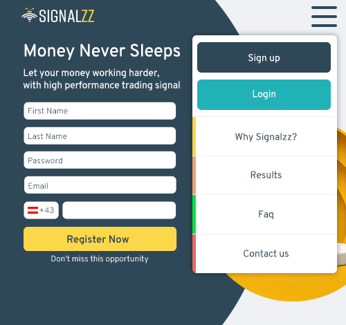
Mobile version menu
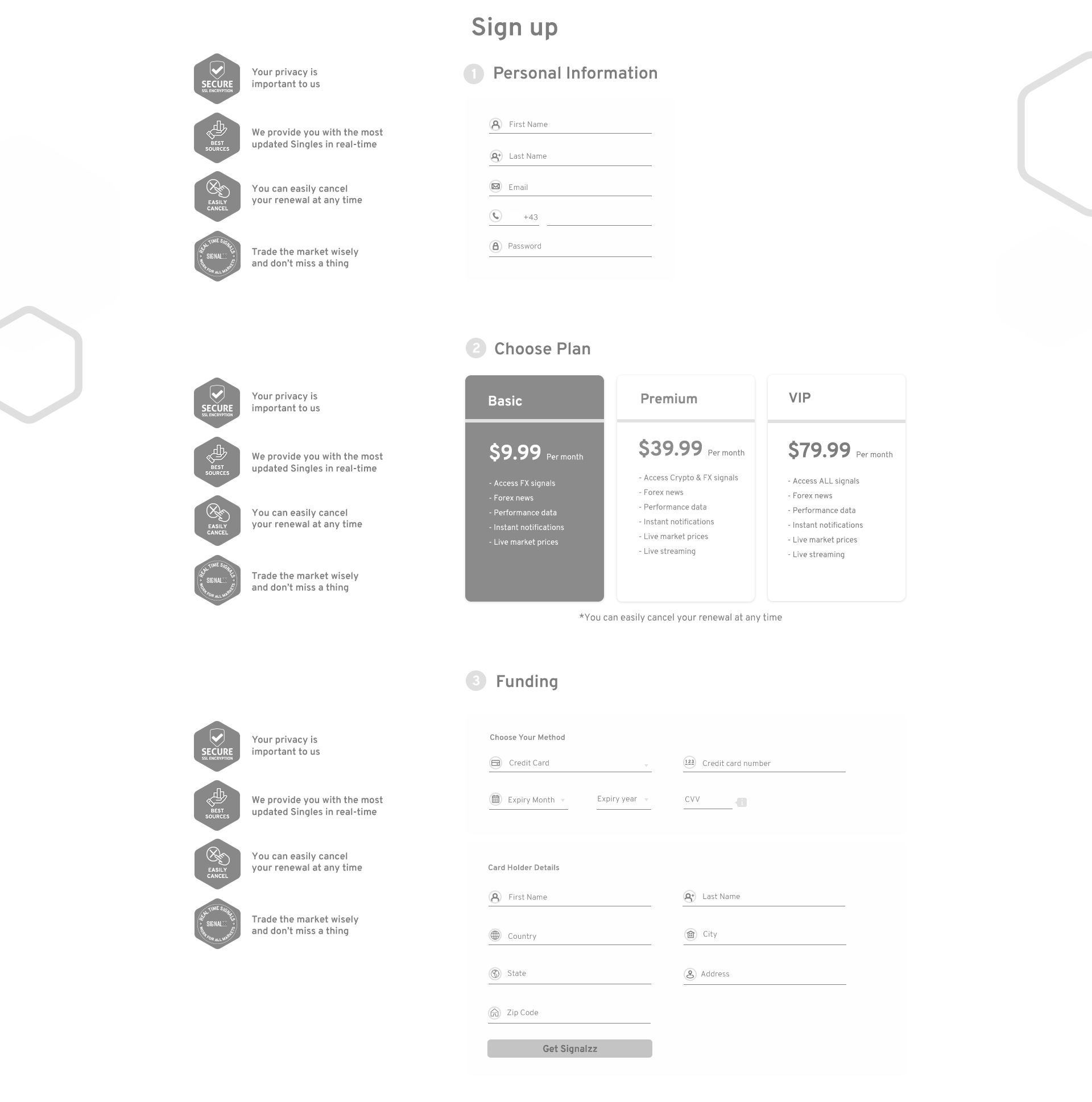
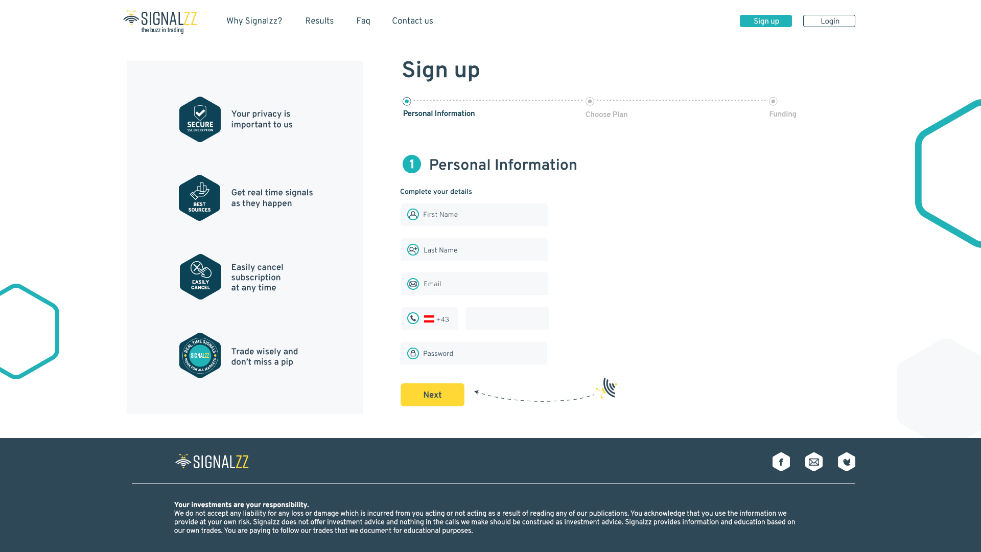
Sign Up
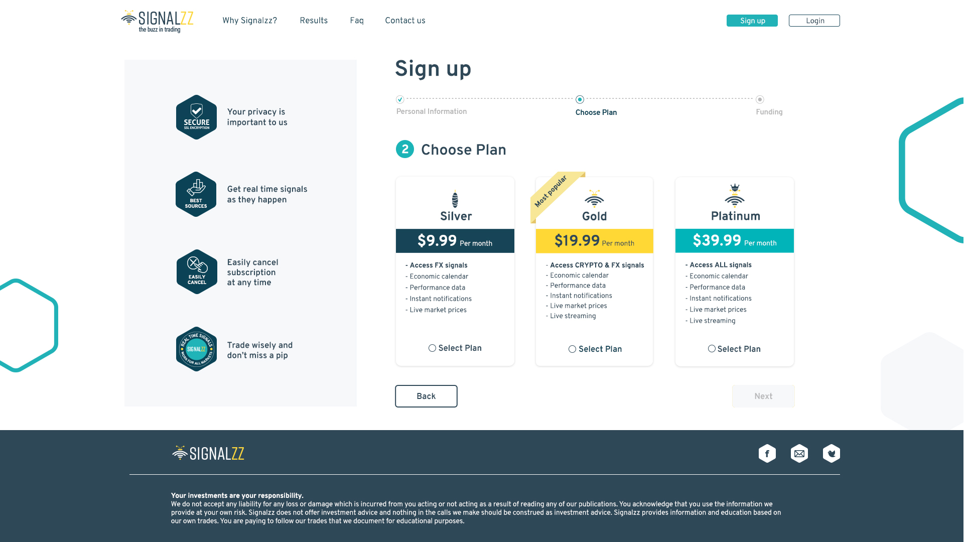
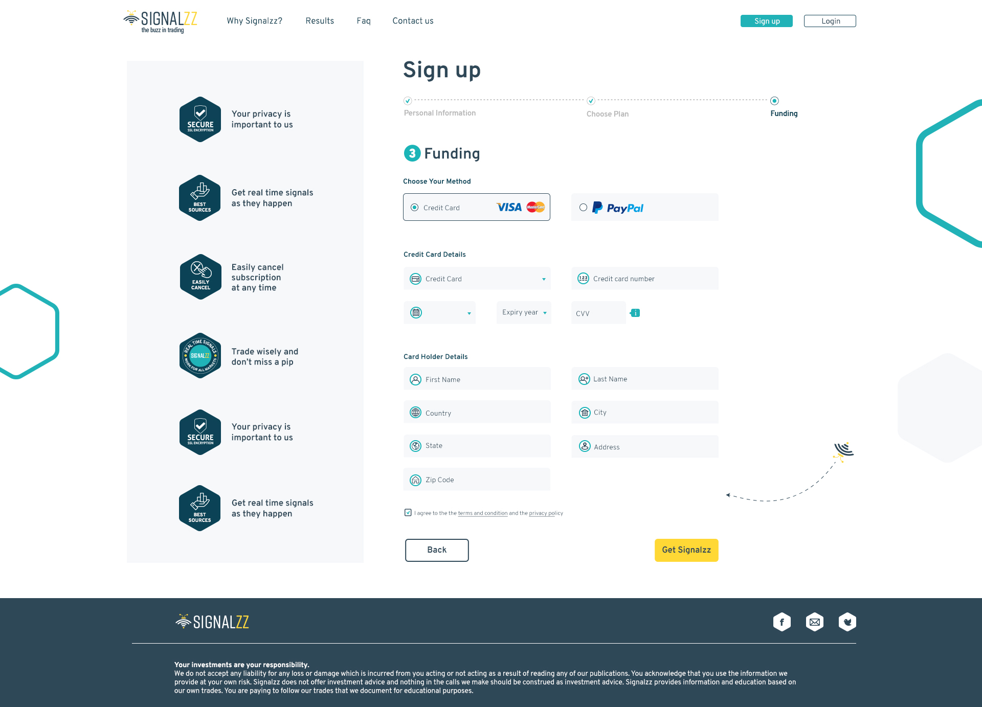
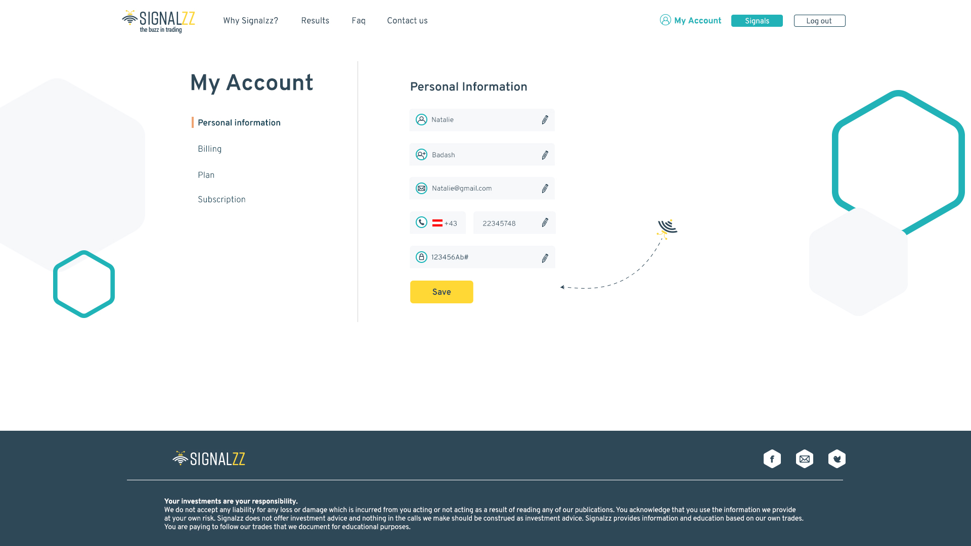
The registration screen sat a design challenge, as it was necessary to maintain order, simplicity and convey confidence. It was necessary to keep separate steps in the registration for it to be organized. I created a division into three parts – personal details, choosing a plan and choosing a method of payment.
At first, I did the registration process with scrolling but very quickly realized that it is less convenient for the user as he will not be able to switch between the different steps.
After several more design attempts, this option was chosen. With such an organization it is possible to progress in stages and return to previous stages easily.
The final design
First Stage – Personal Information
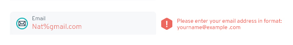
Error message
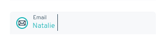
Focus field
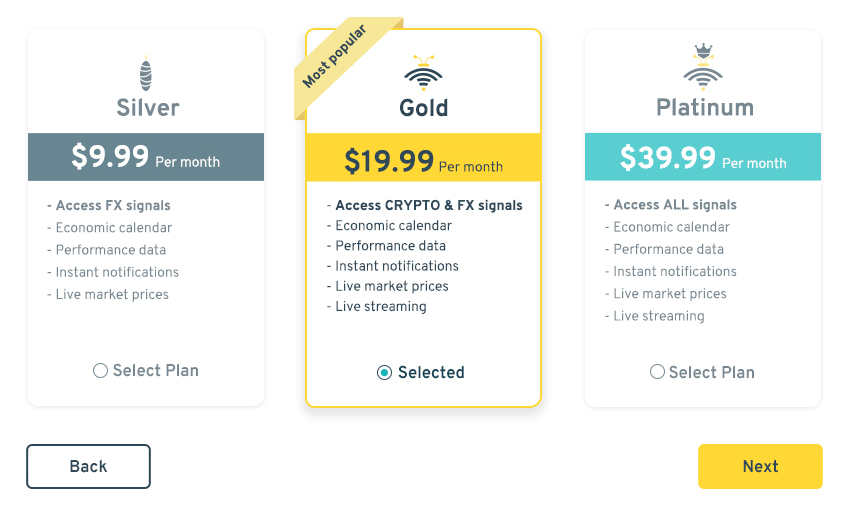
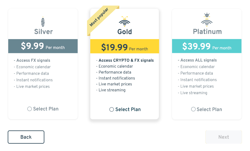
Second Stage – Plan selection
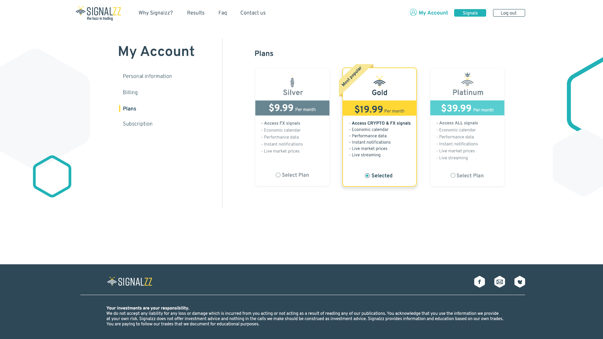
There was a lot of thinking about how to present the plans in a unique way. I stayed with the bee motif, the simplest plan is a "cocoon" than a bee and then the queen bee.
Selected Plan
Hover
Third Stage – Methods of Payment
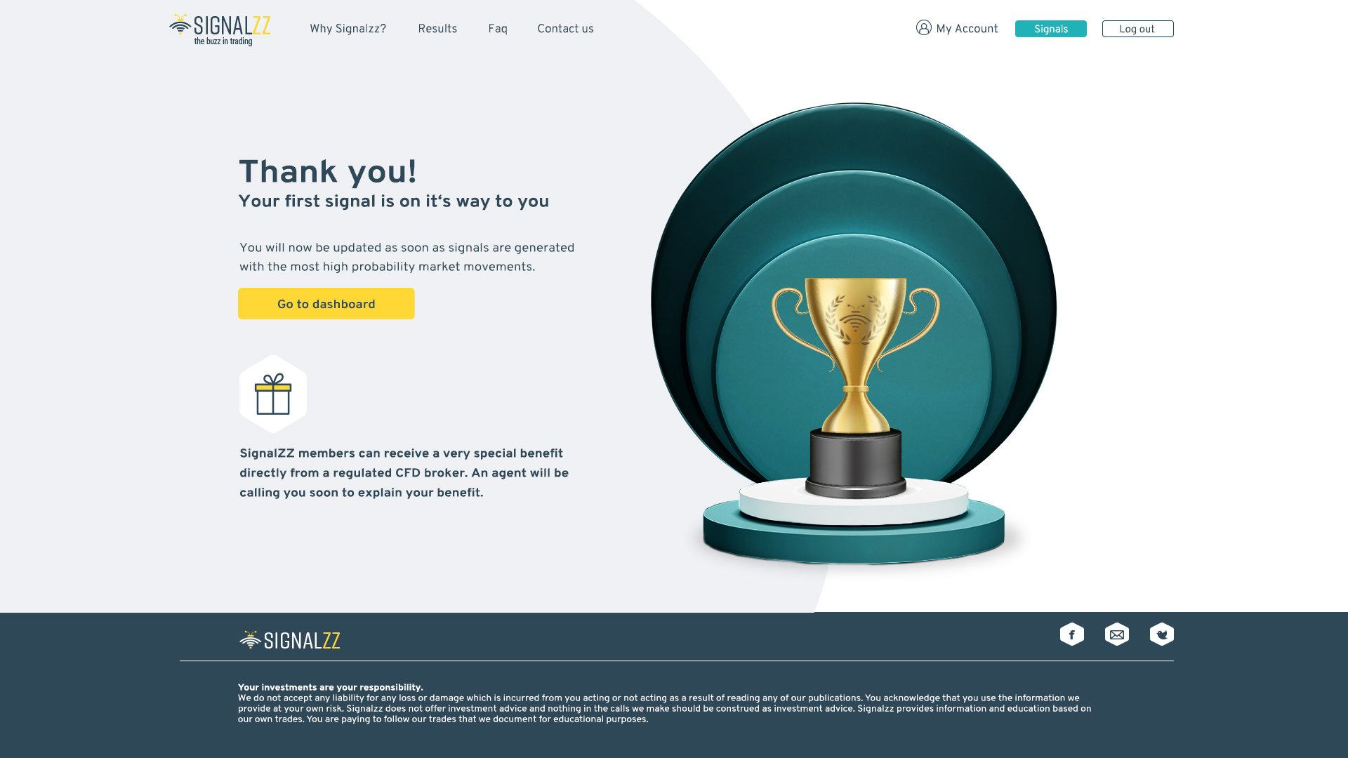
Registration completion screen
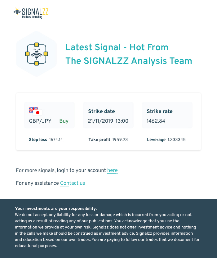
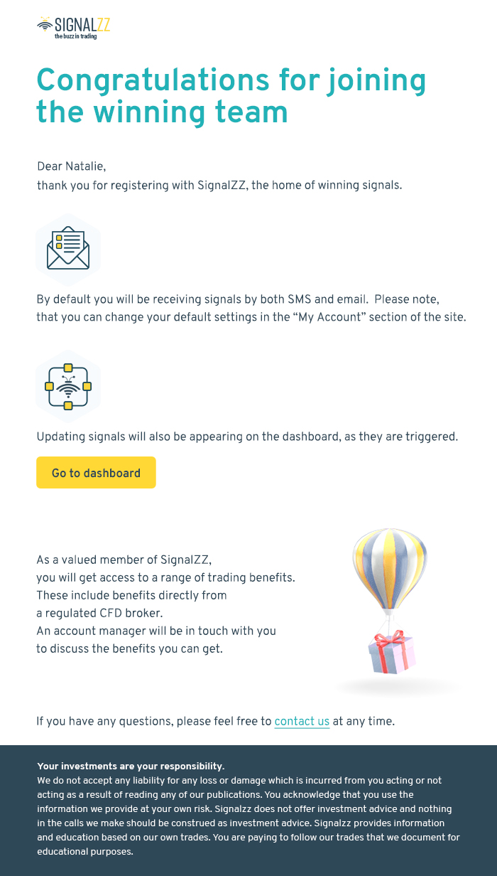
Email upon receipt of a signal
Mail after Registration
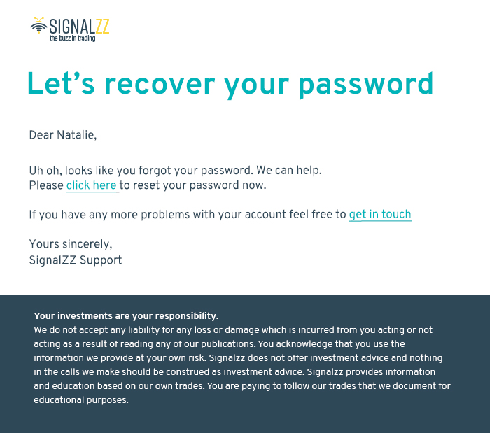
Reset Password
Password Recovery Email
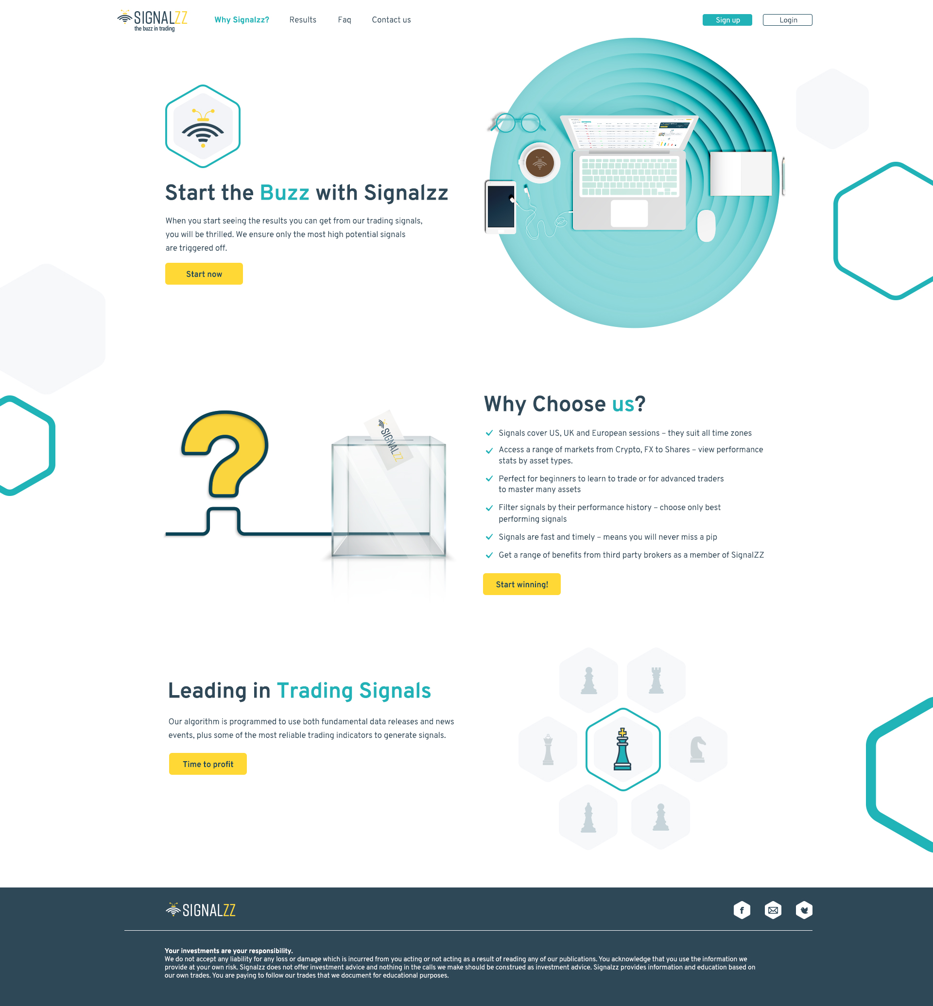
?Why Signalzz
A screen that explains more about the product and what it provides to the customer
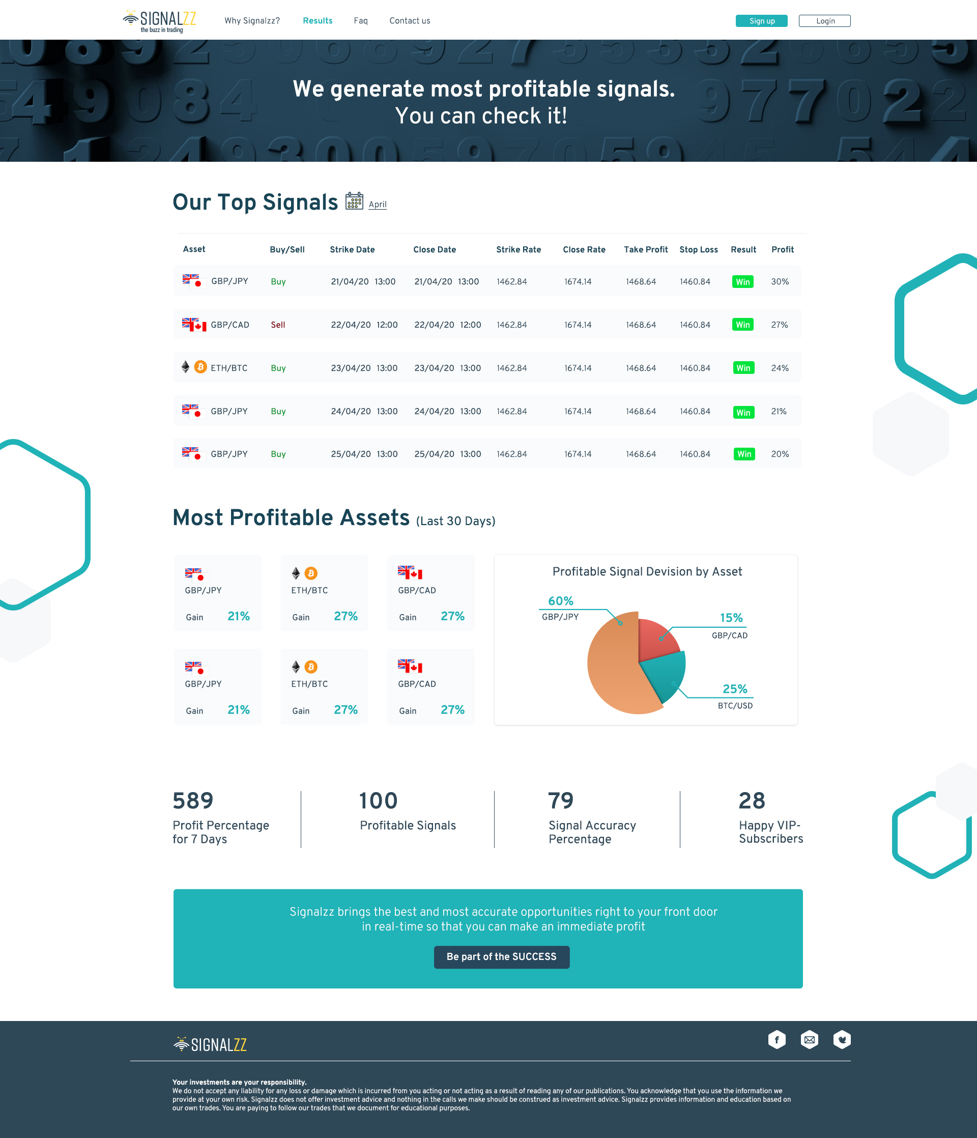
Results
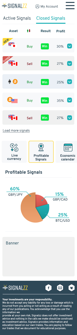
This screen displays information about the latest results of signals. A table presenting the last signals generated by the system and showing if the signals were close enough and if there was a win or loss. In addition, data on the most profitable assets are presented. Information that will actually make the user want to sign up for the system and see more relevant information.
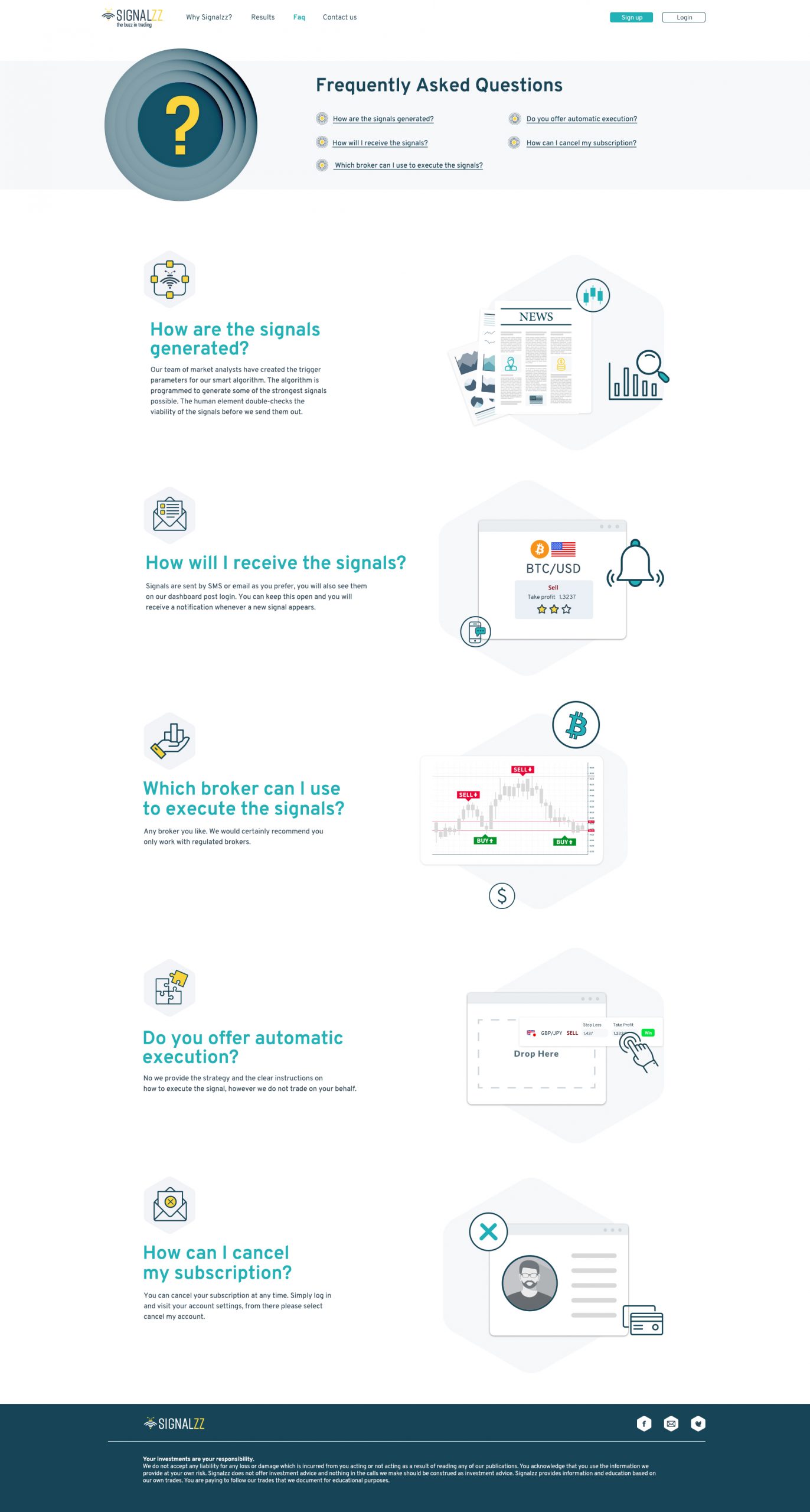
FAQ
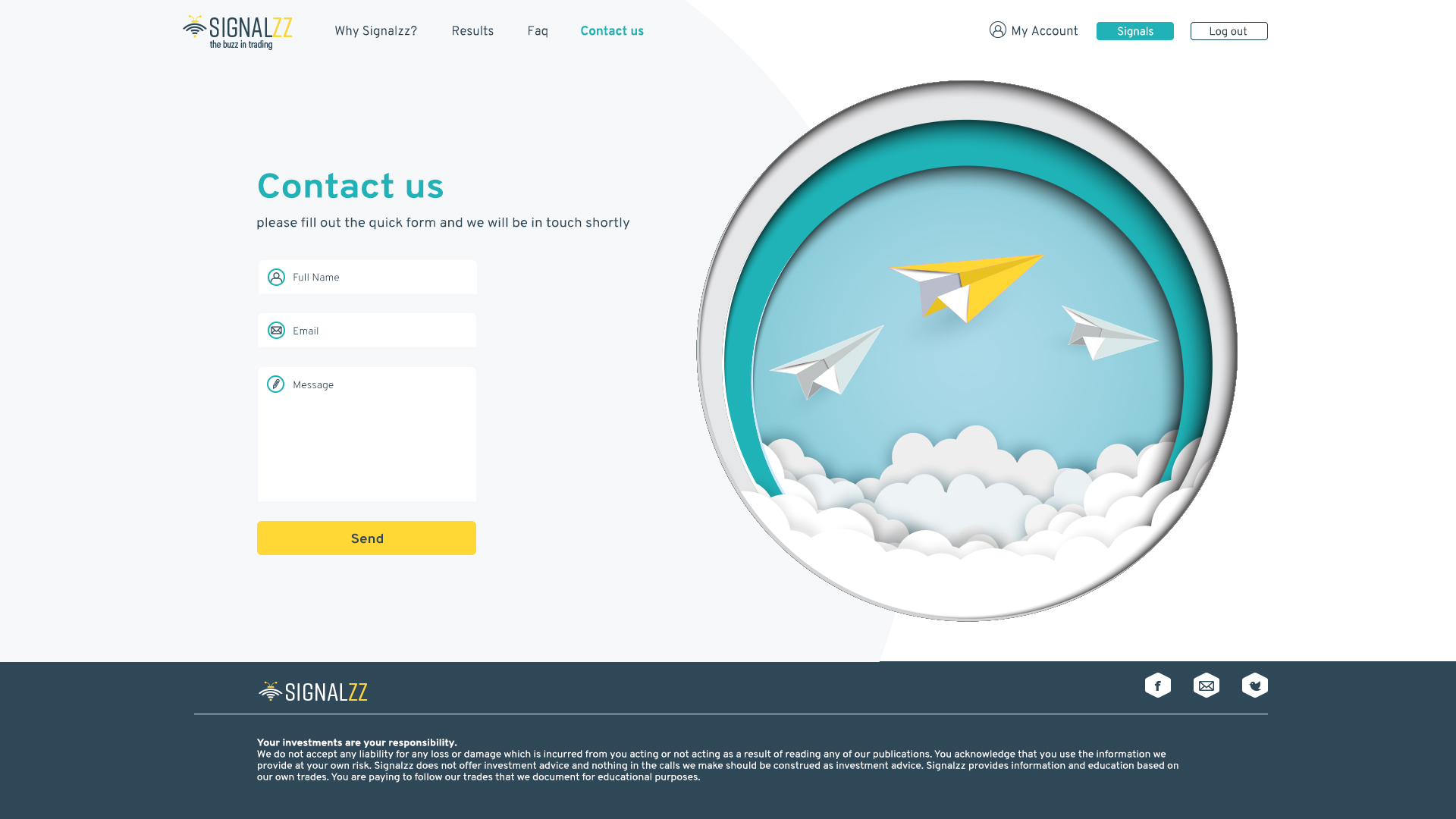
Contact Us
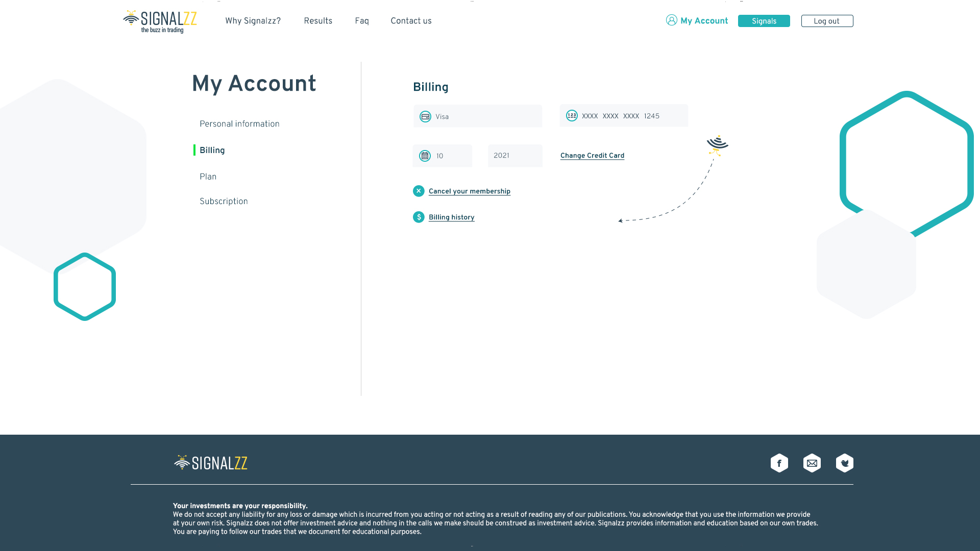
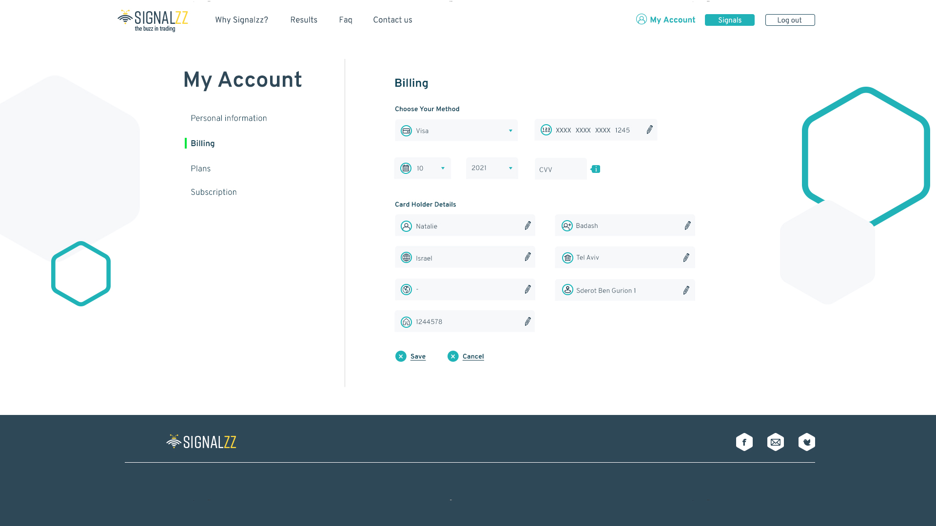
My Account
Billing
In this section, the user can change the credit card he uses for payment, cancel the subscription and see the payment history.
If the user chooses to change credit card, the fields will become editable
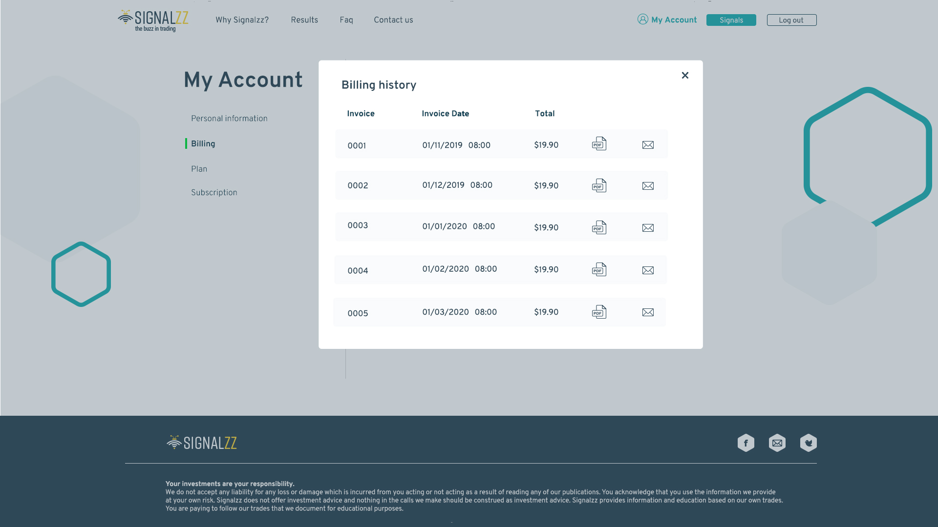
If the user chooses to see payment history, a pop-up window will pop up. It will be possible to see the PDF file of the payment or send it by email.
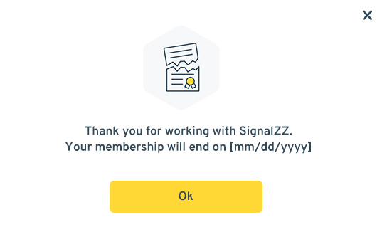
A message after selecting the cancellation of the subscription that says on what exact date the subscription is ended.
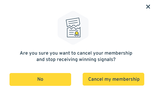
If the user chooses to cancel the subscription, a pop-up message will pop up confirming that the user really wants to cancel the subscription. Since this is an important action, it is necessary extra check according to the cancellation.
Change Plan
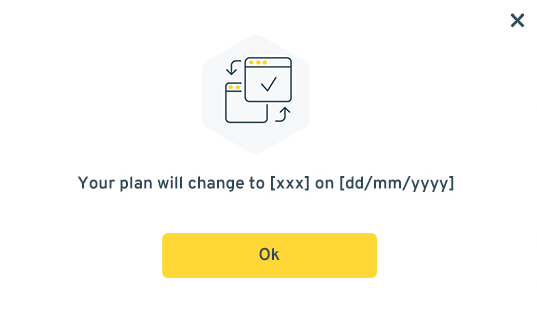
Notice after the change is approved, describing the new plan and the start date of the change.
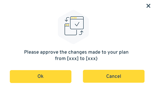
Because a plan change requires a billing change, it is important to make sure that the user really wants to change the plan.
Subscription
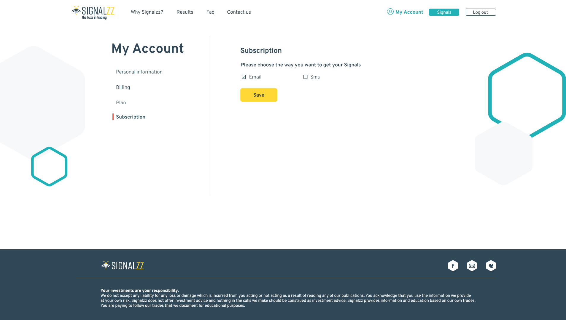
Choosing the way of receiving the signals, the user can also choose both options.
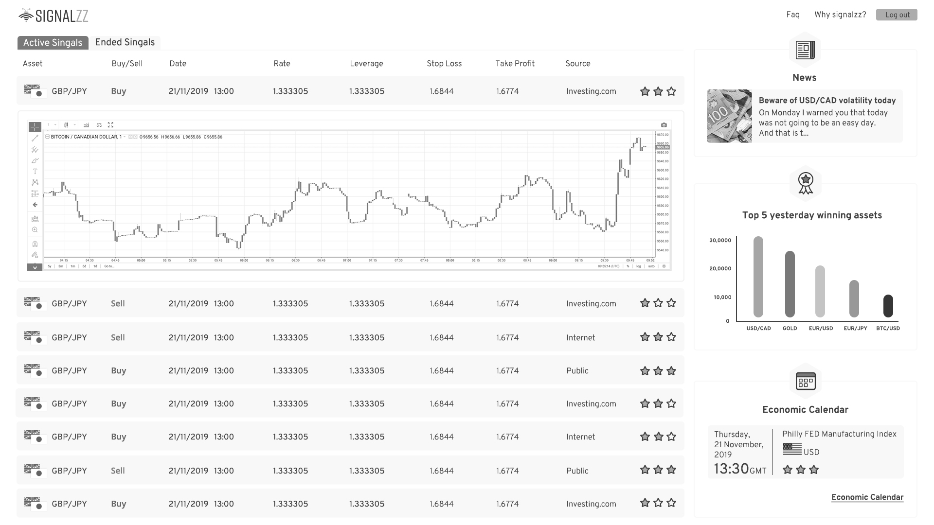
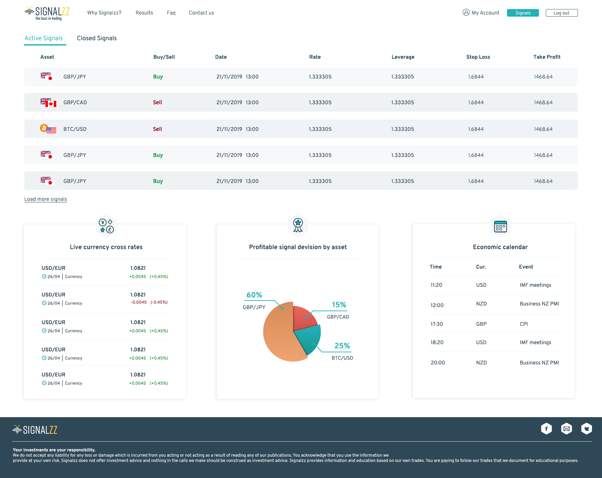
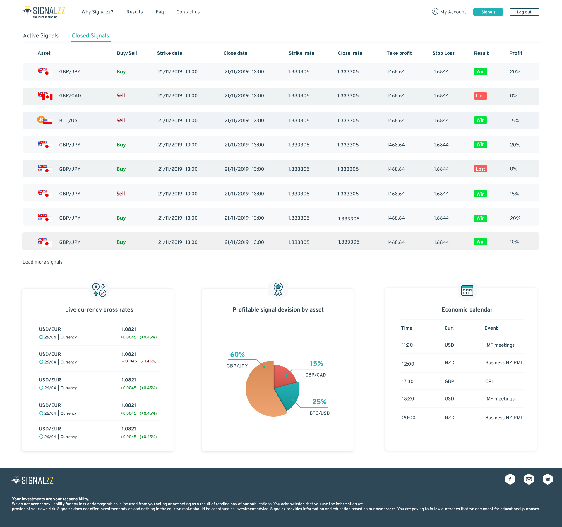
Dashboard
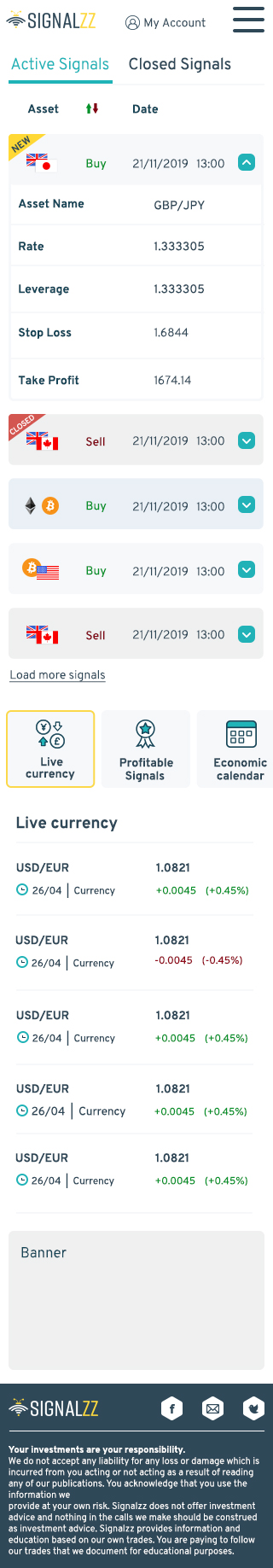
The dashboards display real-time signals and closed signals that have ended. In addition, there is complementary and focused information that can be relevant to the user, asset rates, most profitable assets in percentages and events related to the various assets. This is data that affects the signals and the user can learn and connect this information to the signals he receives.
At first, the division was a little different. On the left were all the signals and on the right was the completing information. Since there may be a situation where there will be only a small number of open signals and thus the area will be empty, I decided to change the structure. In addition, the graph has also been removed because the data in it is a bit too complicated and the goal is to make the system simple for those who do not understand trading at all.
On weekends when trading is inactive you can see a message displayed on the screen that there are no active signals.
Display of active signals
When a new signal appears in real-time, on its side, there will be a label of new and when the signal is closed it will label with closed.
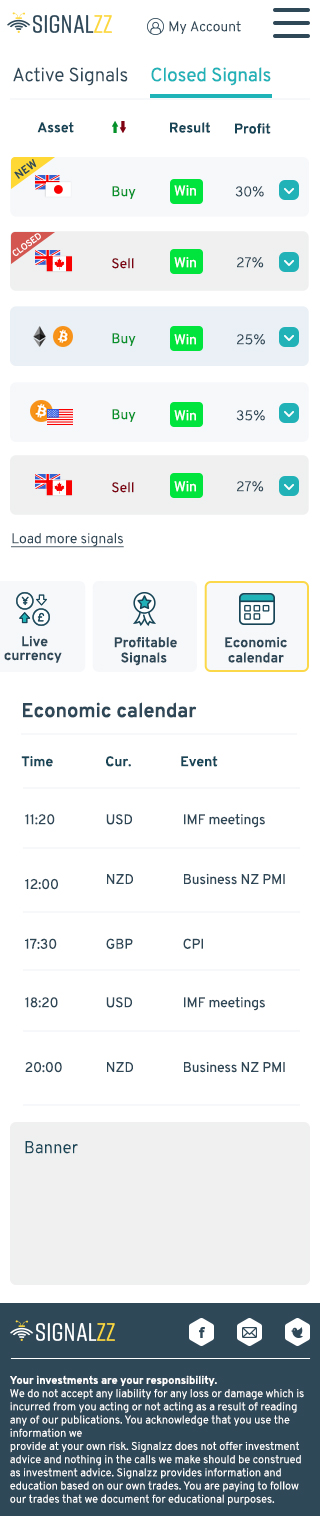
Display of closed signals
Mobile Version Dashboard
The hardest part about fitting the mobile was the table, I was debating between scrolling sideways and this configuration. I think the design in this way is much more successful than scrolling.
?What's Next
Creating a dark mode theme.
Creating an application for a product.
See more of my work:
Helpet – Mobile app
Achievement Center – Redesign project, Desktop app